
One of the reasons I enjoy watching basketball is because I like to see all the different ways teams try to get good shots. Some teams use lots of off-ball action and cuts combined with skillful passing, some teams put an emphasis on getting to the rim and kicking out, and others are more star-driven as they rely on their lead players to create their own shot. Most of the time, an offense will employ a mix of all these ways of scoring. Clustering techniques can allow us to see which teams have a play style that is similar and what trends offensive play styles have followed in the past few years. To find a few different types of play styles among NBA offenses, I will use a clustering technique called k-means. This algorithm groups observations into the specified number of clusters based on which cluster an observation is closest to.
Clustering Features
When using the k-means clustering algorithm, we first have to choose which variables to include. My goal was to cluster offensive play styles, so I avoided any efficiency statistics (like field goal % or offensive rating and so on) in order to capture just play style.
The first variables I chose are scoring type variables. These include the percentage of points from post-ups, pull-ups, catch & shoot, drives, fastbreak, and 2nd chances. These variables are helpful to determine how teams are scoring, like if they are relying on self created pull-ups and post-ups or are trying to score inside with drives and 2nd chance points.
Next, I chose shot selection variables. These variables include the percentage of shots from the restricted area, paint (non-restricted area), midrange, above break 3’s, and corner 3’s. These can show us where teams are trying to score from, such as if they are reliant on shooting from outside or instead are getting high value looks closer to the rim.
Lastly, I chose some other variables that do not fall into either of the previous two categories. These include pace, turnover rate, assist rate, foul drawn rate, passes per possession, and dribbles per touch. I felt it was important to include these because they can relay information about ball movement and play speed.
After choosing these variables, I created a correlation matrix to see if any are heavily related to each other. The correlation matrix below visualizes the correlation of each variable to the others included in the clustering analysis. It is ideal to have low correlations in order to reduce redundancy in variable selection. The k-means algorithm groups observations based on distances, so having two variables that give the same information will give that information double the weight, which is not ideal.

As seen from above, some variables do have strong correlations with others. For example, the % of shots from midrange and the % of shots as above break 3’s are negatively related (so more midrange shots tends to mean fewer above break 3’s, and vice versa). However, I wanted to include shot selection variables from all shot ranges to get a more robust idea of shot selection tendencies.
K-means clustering uses Euclidean distance from an observation’s stats to the cluster center’s stats in order to see which cluster is nearest. Therefore, it is important to normalize the variables so they have equal weight. If we did not normalize, variables like pace (which has a standard deviation of about 2 or 3) will impact distance much, much more than variables like the % of shots from midrange (which has a standard deviation close to 0.03 or 0.04). A common normalization is to standardize, which means to rescale each variable so that the mean is 0 and the standard deviation is 1.
However, in this specific scenario, it would not be a good idea to simply rescale every variable on its own since some variables have the same denominator. For example, the shot selection variables are all represented as a share of total shot attempts. If we standardize each variable on its own, then each shot selection category will have the same spread. However, this is not the case in real life. As shown below, there is a much lower spread in the share of shots as corner 3’s than there is for the share of shots from midrange.

We can see a similar pattern for scoring types. There is a much larger spread for the percentage of points from drives and pull-ups than there is for the percentage of points from 2nd chances. Once again, it is important to note that we can compare these spreads because they are already on the same scale with each other. For shot selection, each variable is represented as a share of shot attempts, and for scoring types each variable is represented as a share of points scored. To deal with this, I standardized these two groups in a way that the overall standard deviation of all shot selection variables or all scoring type variables was 1, but the standard deviation within each specific category could be slightly greater than or less than 1. For example, the standardized % of points from drives would have a standard deviation slightly greater than 1 because it has a larger spread than all other scoring type variables, thereby conserving their relative spreads.

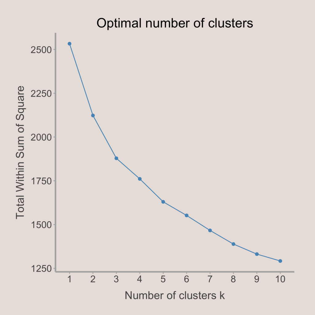
After putting all the features on their proper scales, the last thing to do is to choose the number of clusters. This is commonly done by analyzing a graph showing the spread within clusters against the number of clusters (shown below). To determine the number of clusters, we look for the “elbow,” or the location where the graph makes a sharp turn. Looking below, it seems that the plot is pretty smooth after 5 clusters, so it would be a good idea to limit the number of clusters to at most 5. In addition, there is a sharp decline until we get to 3 clusters, so it would be best to have a minimum of 3 clusters. In order to make the analysis of each cluster itself more concise, I chose to use 3 clusters. However, in my opinion, either 3, 4, or 5 clusters could work for this analysis.
Clustering Output
Now that the number of clusters have been chosen and the variables have been selected and scaled, we can run the clustering algorithm on the sample (which includes teams from the 2018-19 season to the 2022-23 season, for a total of 150 observations). After examining some of the traits of each cluster, I decided to give them names: cluster 1 is “Drived-Based” offenses, cluster 2 includes “Ball Movement” offenses, and cluster 3 contains “Self-Creation” offenses. The clustering output for the teams in the 2022-23 NBA season are shown below.

Upon examining the visual above, one can see that most offenses in the 2023 season were either in the Drived-Based cluster or the Self-Creation cluster, while only the Nuggets and Warriors reside in the Ball Movement cluster. In addition, the teams in the graphic above have been sorted based on closeness to the cluster center. That means teams towards the left (like the Timberwolves and Clippers) are much closer to their cluster centers than other cluster centers, while teams towards the right (like the 76ers and Bucks) are about as close to their cluster center as other cluster centers. In essence, teams towards the right are more of a blend of several clusters but teams towards the left are much easier to classify into one cluster.
Next, to get a better idea of the characteristics of each cluster, we can examine how the cluster centers differ from each other. First, we can look at shot selection:
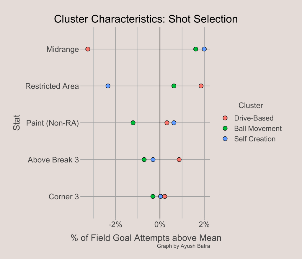
The points on the graph above represent the cluster mean for that stat. For example, the Self Creation cluster takes an average of 2% more of their shots from midrange than other teams. In contrast, the Drived-Based cluster takes an average of about 2.5% fewer of their shots from midrange. Looking at the spread of the cluster centers, it seems that the share of shots from the midrange plays a big part in choosing the cluster that best fits each offense. In addition, Drived-Based offenses tend to take more shots in the restricted area and from 3, while they take fewer midrange shots. Ball Movement and Self Creation offenses both tend to take more midrange shots, but Self Creation offenses do not get to the rim often (fewer restricted area shots). Next, we can look at scoring types:
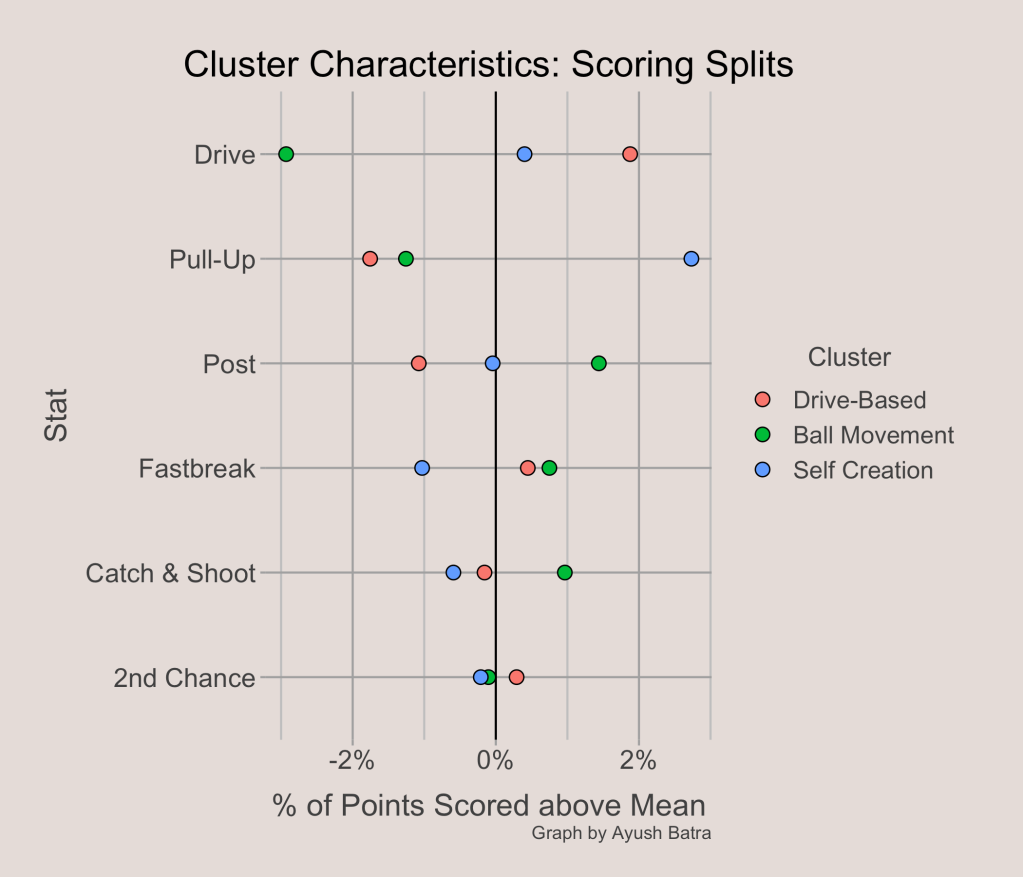
Again, looking at the spreads of the cluster centers, it looks like the % of points from drives and pull-ups are the biggest determinants of which cluster a team gets allocated to. Drived-Based offenses score more than average from drives (hence their name) while taking scoring less on Pull-Ups. Ball Movement offenses utilize the post and score more catch & shoot points than average, but score fewer points on drives or pull-ups. Lastly, Self Creation offenses heavily favor pull-ups than other teams.
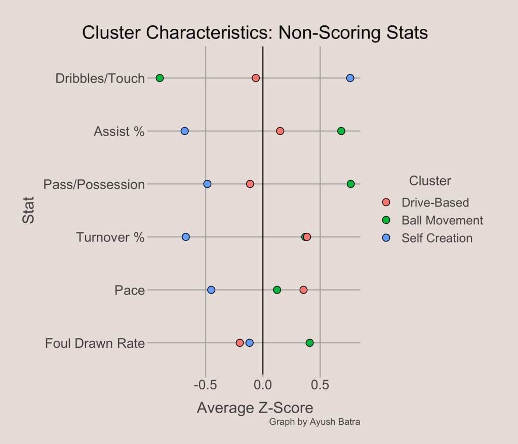
The last category to examine is the non-scoring and non-shooting stats. Among these stats, it seems that passing and ball movement statistics (dribbles per touch, assist rate, passes per possession) have the biggest spreads. In this category, it is clear how different Ball Movement offenses and Self Creation offenses are. Ball Movement offenses have higher assist rates, more passing, and less dribbling while Self Creation offenses have lower assist rates, fewer passes, and more dribbling.
A common way to visualize clusters is to use a PCA plot (shown below). This can be helpful to show which clusters are very different from each other and which clusters have more of the same characteristics.

The x and y axes do not really have a real-life interpretation as they are a blend of several variables coming from a complex mathematical process. However, it is easy to see that the shapes for the Ball Movement cluster and Self Creation cluster have no overlap. This supports the observations that these clusters are almost like opposites of each other. Meanwhile, the Drived-Based cluster is more of a blend of the other two clusters as there is some overlap with both other clusters.
Two Biggest Factors
The two most important variables in determining which cluster a team is in are the % of points from drives and the % of points from pull-ups. To get a more interpretable visualization of the clusters, we can plot these two variables against each other and see the clusters in a different way.

From the plot above, it is immediately obvious how big a role these two variables play in deciding which cluster a team falls in. Teams in the Drived-Based offensive cluster tend to score a large share of their points from drives along with fewer points from pull-ups. The Ball Movement teams tend to have a below average share of points from both drives and pull-ups, suggesting they get points from post-ups, cuts, off-ball screens, and other actions. Lastly, the Self Creation teams tend to have a lot of pull-up points. Of course, the area including teams with a near average share of points from drives and pull-ups has a mix of all clusters as other characteristics likely determine their cluster more.
The graph above included all teams in the sample, but what about just the teams during the 2022-23 NBA season. This is shown below, with the grayed out points representing teams from previous seasons.

The most obvious thing to notice from this visualization is that the Warriors and Nuggets are far away from the other 28 NBA teams. Both teams score a lot fewer points on drives while still not scoring a lot on pull-ups. In fact, the most extreme characteristic of the Ball Movement cluster is few points from drives, which is the primary reason that the Warriors and Nuggets are a part of this cluster. Of course, even though both teams don’t score as much of their points from drives and pull-ups, the points have to come from somewhere. This is where the Warriors’ and Nuggets’ uniqueness comes into play: both offenses have a high share of points from cuts, off-ball screens, handoffs, and other movement actions.

What’s Happening to Ball Movement
The last thing I wanted to explore is how the sizes of each cluster has changed in the 5 year sample I used. To show the changing cluster sizes, I found the proportion of teams in each cluster based on the season, which can be seen below.

There is a very obvious trend in the cluster sizes. The Self Creation and Drived-Based clusters seem to be increasing in size, while fewer and fewer teams are being classified as Ball Movement offenses. But why is this?
After some exploration, I found what variables are driving the Ball Movement cluster’s decreasing size. The first variable is the share of points from dives. One of the Ball Movement cluster’s primary characteristics is a low share of points from drives. However, the NBA average share of points from drives spiked in the 2022-23 season, explaining why only 2 teams were in the cluster this season.
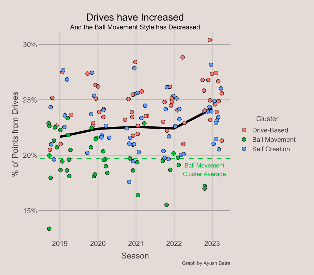
While drives may explain the low number of Ball Movement offenses this season, it doesn’t really explain the decreases from 2019 to 2021. For this, we have to look at another element of offense: shot selection.
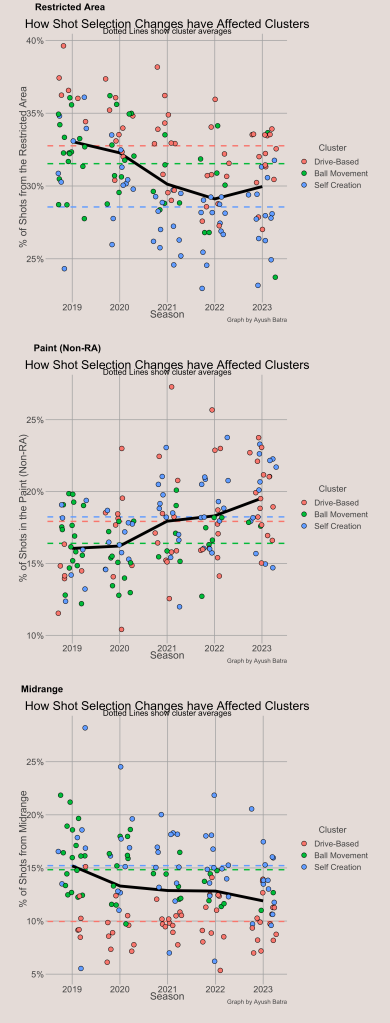
When examining the cluster means for each shot selection category, we found that the Ball Movement offenses had a slightly above average share of shots from the restricted area, a low share from the paint (non-restricted area), and a high share from midrange. Interestingly, the NBA is trending away from the Ball Movement cluster center in all of these categories. The NBA average share of shots from the restricted area and midrange has been decreasing, while shots in the paint have been going up. In fact, one can see that there are fewer and fewer teams near the Ball Movement cluster average after each year in all 3 categories.
In summary, the size of the Ball Movement cluster is decreasing because of the NBA’s trends in shot selection, not because there is less passing and ball movement. In fact, the NBA average passes per possession and dribbles per touch stayed relatively constant from 2019 to 2022.
Summary and Other Notes
I think that clustering offenses is an interesting way to explore some of the different playing styles in the past few seasons of the NBA. Of course, there is nothing special about my choices for variables or number of clusters. One can run a clustering algorithm with a different set of variables and a different number of clusters and come up with completely different ways to group NBA offenses. Moreover, the K-means clustering algorithm relies on a random seed to replicate results, meaning someone could have the same variables and the same number of clusters but still get a (slightly) different result. Still, it is fun to see which teams are unique in their play styles, like the Nuggets and the Warriors, and how playing styles have been changing in just the last few years.
See the code and a more in-depth explanation of the process used to create this analysis here: https://github.com/AyushBatra15/Offensive-Clustering/tree/main

Interesting
LikeLike