
An unfortunate part of professional sports is injuries. Basketball is no exception to this, as injuries derail the seasons of players and teams every year. Since injuries are an unavoidable part of the NBA, it is useful to analyze them. More specifically, in this article I will be analyzing injury time (or time until recovery) for NBA injuries using a survival analysis.
A survival analysis is a study in which you analyze the time until some event. In many contexts, a survival analysis measures the time until death (or survival time) for some group of subjects to see if some intervention makes an impact. A survival analysis is not limited to studying time until death, though. It can be used as long as we are analyzing the time until some event occurs, given the starting point. In this scenario, we will be analyzing the injury time, or the time until recovery, for NBA injuries.
Data
For this article, I used data on injuries from the 2018-19 NBA season to the 2022-23 NBA season, which accounts for 5 seasons worth of injuries and about 5000 total injuries. I webscraped this data from prosportstransactions.com, which had information for transactions where a player was put on the injury list or taken off the injury list.
Censored Observations
I put the injury data that I scraped and cleaned in the format of injury stints, where each observation has an injury start date, an injury end date, and other descriptors (like player, injury description, etc). There are two categories of observations in this format: injuries with a known end date, and injuries with an unknown end date. The injuries with an unknown end date included season-ending injuries and injuries that occurred near the end of the season, where the player did not recover until after their season concluded. These injury end dates are unknown because the website I scraped the data from does not include data about players returning from injury during the offseason.
In survival analysis, there is a way to treat data points such as this. Censored data includes observations where we know at least how much time until the event occurred, but we don’t know exactly how much time. In traditional survival analyses measuring time to death, censored data would include people that the study lost contact with or who died due to circumstances not relevant to the study (like if a participant in a heart-disease study died from a car crash, for example, since the car crash is not related to the study of heart-disease). In this injury analysis, the censored data points will include injury stints where the injury was categorized as a season-ending injury or if the recovery occurred during the offseason. There are established ways to deal with censored data, and I incorporated some of these methods to create the survival curves, which are shown in a later section.
Injuries by Category
The best way to start is to get a general idea of the data. In this article, I want to focus on the length of injuries and how that can vary by category. Below, you can see the distribution for the injury lengths for injuries between 2018 and 2023. Note that this visual includes observations for censored data. For the censored data, the listed injury length is the time between when the injury occurred and the day after the player’s team’s season ended.

The distribution of injury lengths is clearly right-skewed as most injuries last only a couple weeks at most, but there are a few injuries that can take a long time to recover from. The median injury length is 6 days, and 28% of the injuries lasted 2 days or fewer while only 24% of the injuries lasted more than 2 weeks. We can also look at the number of injuries in the data by injury category.

The most frequent areas of injury consisted of Knee or Ankle injuries. Many injuries were in the “Unspecified” category since the injury description the was webscraped only had generic information, like “put on injury list” or something similar. We also see a lot in the Health and Safety category, as many players were sidelined for a few days if they had COVID or were close contacts in the months just after the pandemic.
Next, we want to get a general idea of which injuries are the worst for players. One way to measure this is by looking at what proportion of the injuries for each given category were season-ending injuries. Using this criteria, elbow injuries, foot injuries, toe injuries, shoulder injuries, and Achilles injuries are the most dangerous, each with over 12% of injuries being season-ending. Meanwhile, illnesses and health and safety injuries are the least dangerous, which makes sense as players usually return in a few days after these ailments.

We may want more information than just about season-ending injuries to determine the severity of each injury category. Injury length gives us a better idea of how long it takes for players to recover from certain injuries, so we can use this to evaluate the most dangerous injuries as well. The box plots below show the median injury length, along with the 25th and 75th percentiles for injury lengths in addition to any outliers (the points that are outside of the bars). This shows us both the typical injury length for a certain injury type along with its spread. We can see that hand injuries have the greatest median recovery time at 16 days, while finger injuries and shoulder injuries also have a high median recovery time. In contrast, illnesses have a typical recovery time of just 3 days. Wrist injuries, finger injuries, and thumb injuries have the greatest spreads in recovery time, as their interquartile ranges (75th percentile of recovery time minus 25th percentile of recovery time) are 34 days, 31 days, and 29.5 days respectively. On the other hand, illnesses and concussions have the lowest spreads in recovery times, with interquartile ranges of 3 days and 4 days respectively. We don’t really know how bad an injury to some part of the hand (hand, wrist, finger, thumb) will be, but we can be certain that a player will recover from an illness or a concussion in short time.


Survival Curves
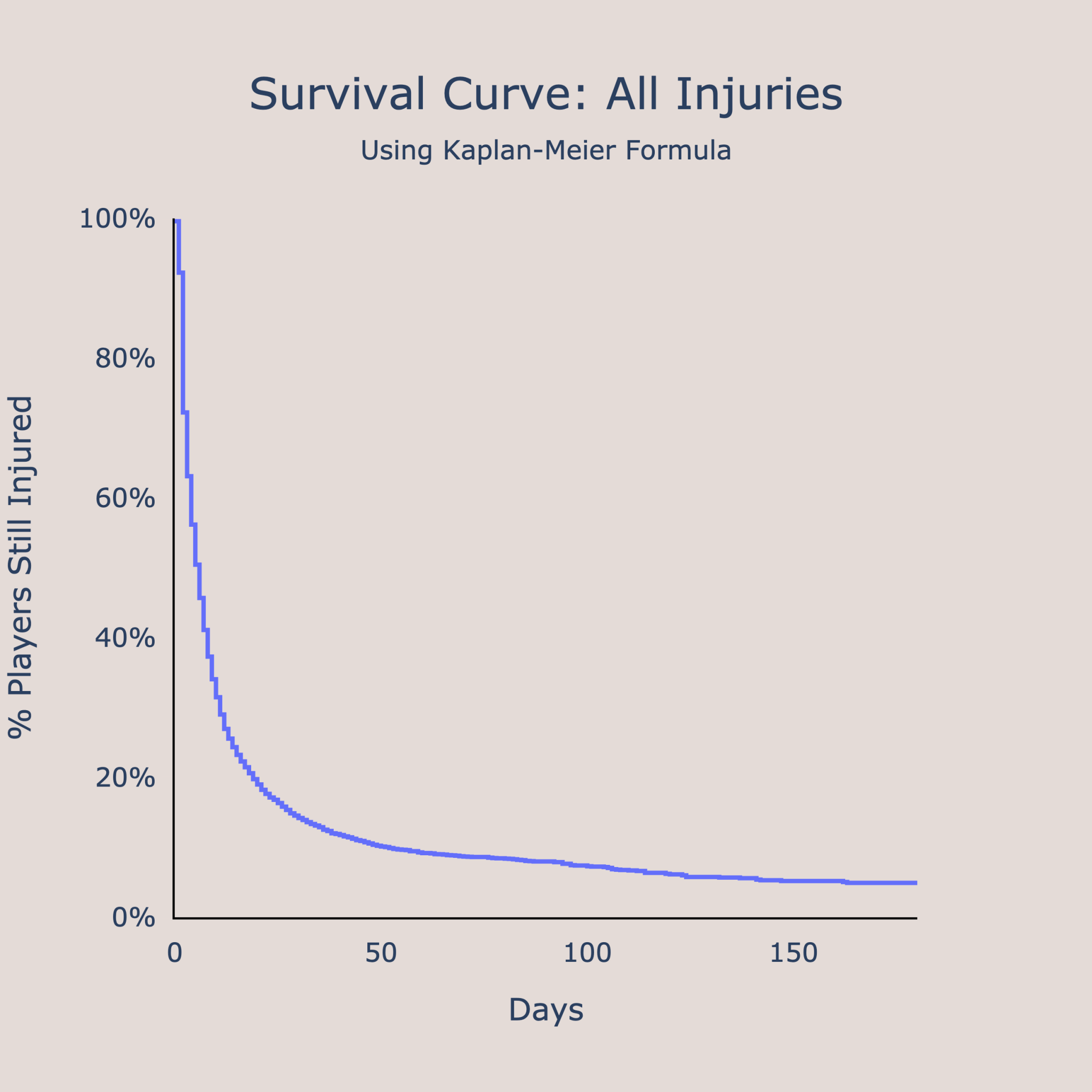
A different way of analyzing the time to recovery is by using a survival curve. In survival analyses, the survival curve traditionally plots the % of participants still alive against time. In this situation, I plotted the % of players still injured against time. We use the Kaplan-Meier formula to incorporate both censored injuries and uncensored injuries, although the exact details of the formula aren’t relevant. The overall idea of the survival curve is to get an estimate of what percentage of injuries are still being recovered from after some amount of time. For example, in the survival curve below showing the percentage of players still injured against time, we can see that after 50 days, about 10% of injuries are still being recovered from. Another way to interpret this is to say 90% of injuries have been recovered from after 50 days since the time of injury.
We can use these survival curves as another way to compare the severity of different types of injuries. By overlaying survival curves for different injury categories on top of each other, we can see which types of injuries take the longest to recover from and the least time to recover from. In the example below, it looks like foot injuries have long recovery times as about 20% of the time it takes longer than 50 days to recover.

When looking at the survival curves, I realized that curves with more area under them are considered to have longer recovery times, while curves with smaller areas under the curve have shorter recovery times. The graph below displays the comparisons of the areas under the curves for each injury category. Note that the units are in comparison to a baseline of 1, where the baseline represents the area under the curve for all injury types. To get the normalized number, you just divide the area under the given curve by the area under curve for all injuries. I did this because I don’t think the raw units of the area under the curve have any real meaning in this situation.
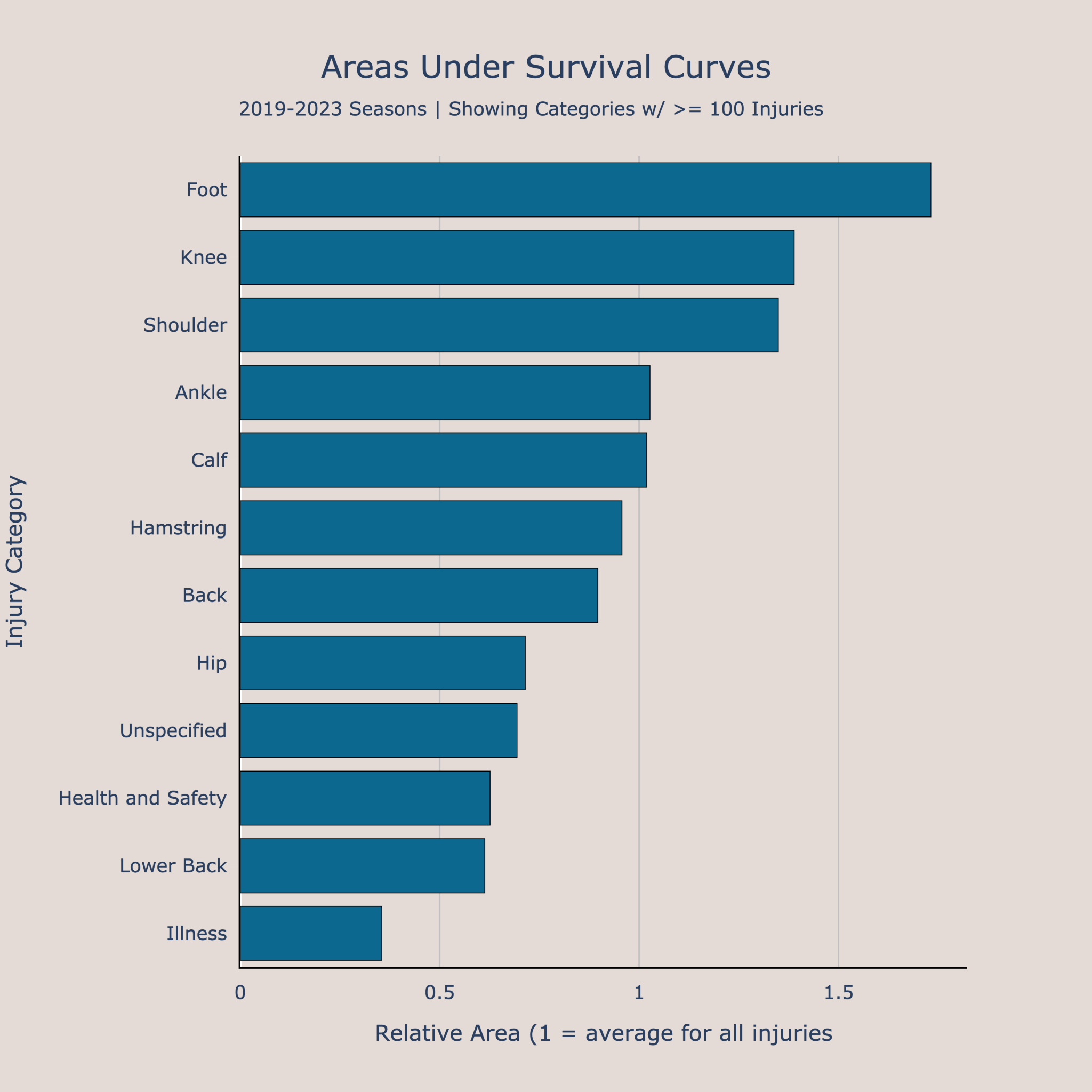
Using area under the curve, it seems as though foot injuries, knee injuries, and shoulder injuries have the longest recovery times among injuries with at least 100 observations. Meanwhile, illnesses have the shortest recovery times. I feel that the method of comparing areas under the survival curves is a good tool since it gives a more robust comparison of the entire distribution of recovery times for each category, although it is not as interpretable as using traditional measures like the median or quartiles of recovery time.

Comparing Injury Types
The last section looks at comparing two different injury types. As an example, I used knee injuries vs ankle injuries, as knee and ankle injuries were the two categories with the most observations. We can start to compare these injury types by overlaying their survival curves, as seen below. It looks like knee injuries tend to have longer recovery times from this, as knee injuries have a greater proportion of players still recovering after 50 days or after 100 days. However, how can we know if this difference is significant?
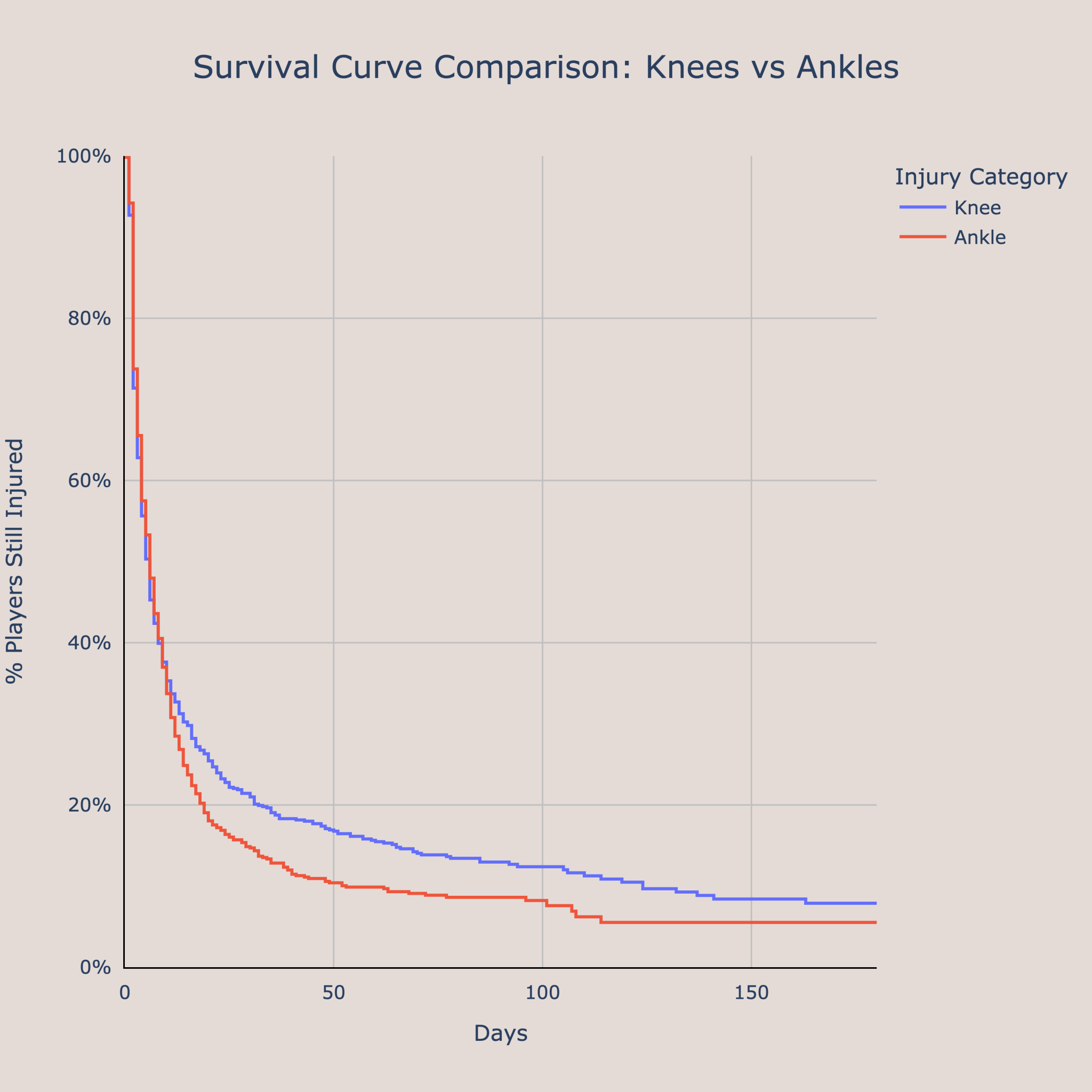
We can compare two different survival curves using the log-rank test. We see if there is a significant difference by comparing the observed number of recoveries in both groups to the expected number of recoveries if there was no difference between the two in reality. For the example of knee injuries vs ankle injuries, the p-value was 0.083, meaning that we have a 8.3% of getting the observed data or more extreme is we assume there is no difference between recovery times for knee injuries and ankle injuries. This p-value is not technically statistically significant at the traditional 0.05 level, but its in the range where it could be considered significant and could be considered not significant. In my opinion, it is better to get a more holistic view of comparing the injury types by comparing their distribution and survival curves as opposed to relying on a single p-value, but the log-rank test is still a very useful tool.
Conclusion
The overall point of the article is that we can use a survival analysis to compare different types of injuries in the NBA. In the exploratory data analysis, we saw that knee and ankle injuries were the most common injury categories, and elbow and foot injuries had the highest proportion of season-ending injuries. Injuries to parts of the hand (including finger, wrist, thumb, or hand) tend to have a large spread in recovery times, while we are more certain of the recovery timeline for illnesses and concussions. We can use survival curves to see what percentage of injuries are still being recovered from after a certain amount of time, and also to compare different injury types. Looking at area under the survival curve, foot injuries seem to be the most dangerous and cause the longest recovery times. Other injuries with long recovery times include knee and shoulder ailments. Lastly, we can compare different injury types using overlayed survival curves and the log-rank test. Injuries are an unfortunate but large part of basketball, and a survival analysis get help us get a better idea of the recovery times for different injuries.
See the code I used for this project here: https://github.com/AyushBatra15/Survival-Analysis
- Optimal NBA Team with Genetic Algorithms
- Mapping NBA Futures: Simulating Career Trajectories with WAR Projections
- Predicting Future Performance: The Best Shot Creators, Shooters, and Defenders in the 2024 NBA Draft
- Projecting Future All-Stars in the 2024 NBA Draft
- 2024 March Madness Predictions: Which Teams are Over and Under-seeded
